Thursday, 30 November 2017

Pre-final (George)

Hello, I'm in the stages of finalizing my painting and I've been trying to spot any corrections or details. I would like if anyone has a great eye to spot something that could enhance the image. Any feedback is appreciated.


1) Pre-final version


2) Grayscale of prefinal

Wednesday, 29 November 2017

Feedback request

For the life of me I can't figure out where to position the other people around the fire.  I don't want them to seem like robots. The problem might even be that the fire isn't in a good place.  I have no idea at this point.  What do you suggest?


Need suggestions / comments / "approbation"? (Démie)

Hello,
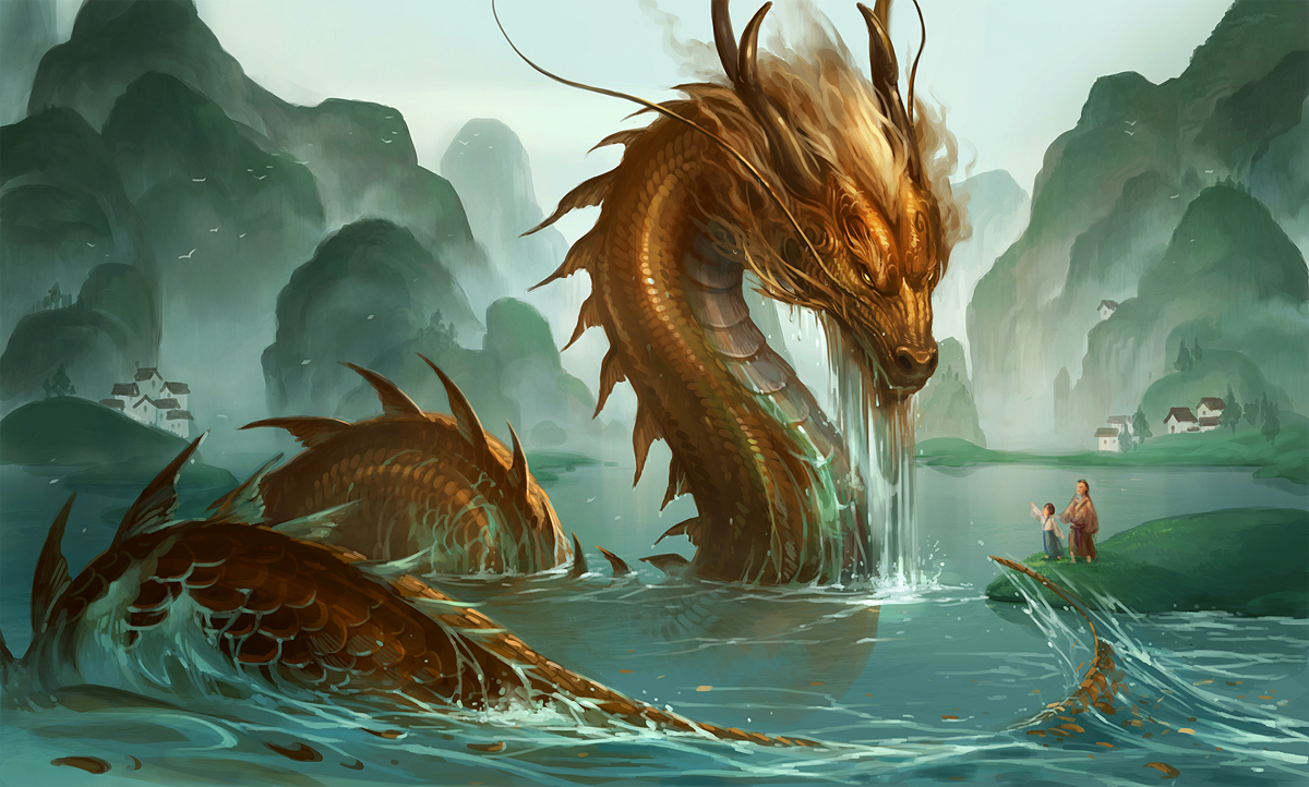
So, I was working on my dragon's head and because the horns and the face is so big in the whole composition (like ¼ of the painting or so), I thought that they need to be more detailed and well rendered (I'll do less and less details on the dragon body as it moves away from the center of attention.

I'm happy with the rendering of the horns, but I'm not so sure with the effects of the scales on its face. I tried couples of things, most were ridiculously bad... And I came up with this test that was... better (inspiring myself with iguanas faces/scales), but I'm not convinced it's going to do the job. For now, I have painted only the forehead with this effect pushed to the fullest.

It might end up looking too much like the "camouflage" effect Mr. Vinh was referring to in class... It also feels like there's too much contrast too?

So I need to consult about this, before I get any further!


I wish I could to something more like this one (though in this case, the tail is closer and the head it farther, so more details on the tail, less on the face, etc.) But I'm seem to be incapable to do this rendering (like on the neck) @_@


Monday, 27 November 2017

Feedback


Feedback: Andrew, Anna


Feedback


Week 8 - Tarik (in progress)


Week 8 (In Progress) - Claire


It's still a work in progress, but this is where I'm at so far.

The Ajna Merchant


Two versions, the bottom one is probably the more solid of the two but I want to be certain! \m/

Week 8 (Jeremie Berlanga)

Had to play around a lot with my perspective. Perspective is better I think.
I need more filler for the walls and a texture for the floor. Not sure exactly what I want to do with it.
I have the character but wanted to add it after I render the BG a bit more.
Any advice is much appreciated.
(With candles)

Thanks

Sunday, 26 November 2017

Week 8 - George

This is my last and final draft. I do not want any changes. I like it how it is. I will start the main painting soon because I haven't started it yet.. Any comments and critiques are welcomed.


***COLOR TESTING***


Week 8 (Andrew)

Hello! The painting is still a work in progress so any feedback or critique is appreciated, thanks!


Week 8 - in progress


week 8 - Nicolas Chacin

I've changed some of the light sources to focus in the main action of the scene. Any feedback is welcome. thanks!


Mauricio week 8


week8 (Anna)


Week 8 - BrimRun

Hi,, This is what I got so far, I'm much happier with it now and I like where it's going :)

How to make "textured strokes" with brushes?

Hello :)
I noticed that some artists (and students too!! ^_^ ) are using a graphic style with texture on their strokes

Example:

This is something I never got to play with and have no clue how to do these effects. Maybe I'm one of the very few and it would not be worth the time in class... or maybe not? :)  (I don't even know if it would take long or not to show how it's done) D: 

Anyhow, I would be interested if I could have some pointers at least :)

WIP week 8 (Démie)

I did struggle with my dragon head, I couldn't get satisfied and I found it hard to understand the shape of the face and the horns. Using a couple of photos refs, I tried to break down the shape like "top view" and "front view" (which helped a lot!)


So I went redraw the head in 3/4 profil, did the value sketching. At that point, I felt there was a contrast problem, but wasn't sure how it would played out.

So I did a very ruff and quick color sketching/test. A then saw where it felt wrong, corrected it. (I did some corrections on the horse too, but photoshop crashed and lost it... So the horse is a little too "bright"; I'll re-correct that later).

The color is very ruff, it's a WIP. The dragon should look like glowing with a fire from within... I'm not quite sure yet how I'll render that; I have a couple of ideas I would need to put to the test...

So, here's where I am at now:


Week 8 (Simon)

Im still missing the main character ( on the patio). Not quite sure what he will be doing yet...
Also, I'm not sure if the painting is too buisy...
For the rest, I'm happy with the way it's turning out !.


Week 8_Yutong

I changed the first piece and started coloring. Ah it's so hard...


Final - in progress (Noah)

This is where I am at the moment.  Still not done but I like how it's coming together

Saturday, 25 November 2017

Feedback-George's

- Check for the perspective: House, fence ( and it's a little big to go with the tractor).
- I'm not sure about the   big tripots  (B) in foreground , too massive compare to other elements. A tree, small lamp post could be more interesting if you want having something there.
- The person looks like he doesn't care about the rocket launching. I think he should stop and look


Thumbnail Progress - Requesting feedback

Hello. I'm also finalizing my thumbnail. I added a hill in between the house and the fence to make the space bigger in between. I would like to have feedback as well before i start the main painting.


Friday, 24 November 2017

Feedback: Brimrun's

The silhouette of the giant is very good and of course you can add the group of soldiers but we don't want it looks too crowded and heavy on the right of painting. A small mass on the left should be good to counter balance.Watch for the contrast between the mountain and the group on the right.The giant( closer)should be darker than the mountain .


Thursday, 23 November 2017

Thumbnail progress - feedback please

Hi, so I decided to add and "army" behind the main guy to fill up the space and make it more interesting. I just don't know if the drawing looks better with  out the army or not. Please let me know what you think.